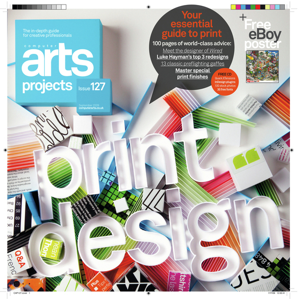
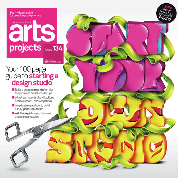
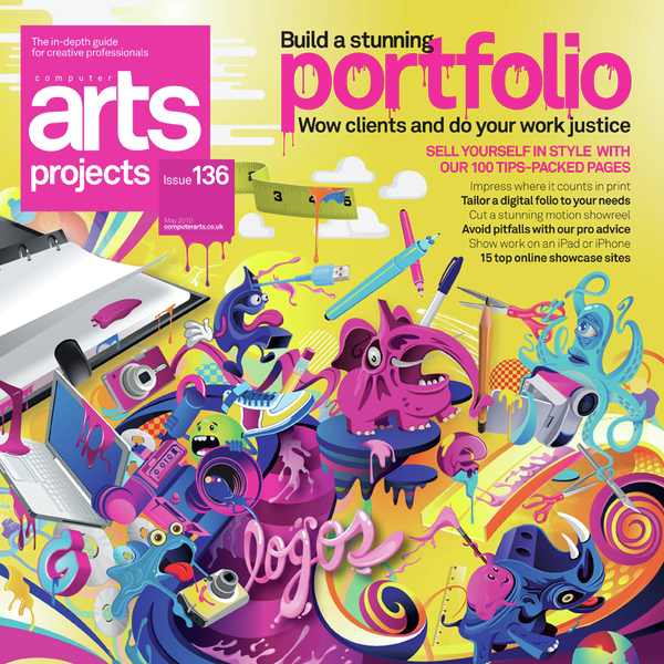
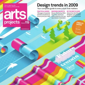
For those who don't know what "Computer Arts" is, or have been living under a rock. Computer Arts is like the holy bible for designers and artists. They have been publushing for years and have excellent quality articles and tutorials for people who are interrested about designing. Highly recommended for students and for beginning artists. And what Computer Arts is also well known for, is for having the best looking cover designs any magazine would dream of, usually they publish designs from differently individual artists and each one of them are a work of art to look at! Made a collection of highly inspiring poster designs that will keep your creativity busy. Some of them are beautiful to have as real posters. Design at its best!
For any given product or service, there are a million different ways to advertise its benefits and offerings. The tricky part, however, is matching a brand's intended message with a creative, eye-catching execution that is both interesting and memorable to the consumer. This is particularly difficult when working with billboards, a medium that is so commonplace in our modern world that people hardly seem to notice them anymore. While most companies still struggle to find new, innovative ways to utilize billboards to reach their target audience, some companies have already begun thinking outside of the box. This packaging design by Andrew Seunghyun Kim for Coca Cola bottles is a bold and something that Coca Cola should definitely consider doing. The new bottle design is 100% eco-friendly. It's slick, futuristic and vastly different from Coca Cola's packaging which would be the reason they wouldn't pick this up. The cap is 25% slimmer that the current 20oz bottles and 27% more eco-friendly because it greatly reduces the footprint. This design is 65% more collapsible than the current bottle encouraging more recycling due to ease in transport. Environmentally conscious people can easily collapse the bottle, carry it around until the can recycle. The design is brilliant. The bottle looks futuristic, stylish and luxurious. Packaging is extremely important to brand so this would be a giant step if Coca Cola considered this. However, it would be a step in the right direction and with some heavy marketing Coca Cola can use this to position their product and company as 100%. I would be more loyal to Coca Cola for that simple fact. Source: DesignersCouch When feeding your dogs with bad food, they will turn their backs on you according to Nutri Balance. Chilean ad agency Prolam Y&R shows us what happens when man's best friend becomes man's worst enemy.
Swatch Creart / Grems from THANK YOU on Vimeo. For a high profile launch in Venice of the new Swatch Art Collection, a series of watches decorated by international artists. We were commissioned by Swatch to tie together the entire campaign by unifying the different watches into one over-arching idea. Our brainchild was the Art Machine, a crazy, fast moving mechanical-looking device that creates art and spits out watches, while working to a time-related beat. A colorful mixture of materials and techniques achieved the right attitude for the films with the campaign successfully launched on all media fronts world wide.
http://www.thankyou.dk/ Project: Swatch commercials Sound: Yann Coppier Here is an interresting video on how they make a magazine cover. Items used are ofcource an Iphone. You would always think it would be easy to do something like this. But with the magic wonders of fast forwarding you can see it takes alot more time then you realise. Cover creation from Peter Belanger on Vimeo. NPower's latest campaign by VCCP features beloved pop-culture icons Wallace and Gromit. Britains favourite animated characters are up to their usual inventive mischief in delivering Npowers message of sensible energy consumption in the home. The loveable duo soon learns a valuable lesson in monitoring energy, as another invention goes wrong. A collection of interresting adds used on trucks. Very eye catching for sure. Maybe a little bit too eye catching if you ask me, that is, when you are trying to keep your eyes on the road!
Zeiss came up with this add to advertise their glasses. Mercedes Benz demonstrating their brake technology. And Land Rover using "tilt effect" to make it look like a toy.
|
Subscribe!Categories
All
Archives
December 2011
|